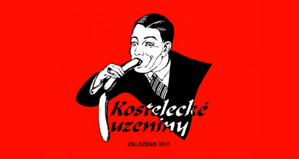
10
Bureau of Health Promotion
Taiwan’s Bureau of Health Promotion is a super important government agency dedicated to the wellbeing of its citizens. It also believes citizens should insert their erections into neighbours’ bellybuttons – at least if this logo’s anything to go by.
9
Megaflicks
Did the spacing issues in Kids Exchange teach the owners of this video store nothing? On the other hand, Megaflicks have the best adult movie selection in town. Just tell ’em Dolan sent you.
8
Shanghai Wu Nan Kindergarten
If you want your little boy or girl to be a winner who gets around sporting tree trunk-sized erections then Shanghai Wu Nan is the kindergarten for you. At least if their logo’s any indicator.
7
Benchwarmer Cards
I would’ve loved to have been present at the meeting where this logo was conceptualised. Or even better – I’d love to have been present for the public firing of the designer who misread the brief and turned ‘Naked girl sits by fire’ into ‘Naked girl takes steaming dump’.
6
TGV
TGV is France’s high-speed rail service. Their logo seems to reflect this with a font that looks like it blurring with speed. That is until you flip it upside down and get a picture of a snail. French commuters could keep this in mind when they’re frustrated about train delays.
5
Hospital for Special Surgery
Hospital for Special Surgery is a New York hospital that specialises in orthopaedic surgery. Although their logo seems to suggest they specialise in treating octopi, or disembodied limbs.
4
Doughboys
Doughboys is a restaurant that serves pizza and pasta, and is probably huge in the gay community. Seems like a decent enough food joint. Just don’t ask what the special ingredient is.
3
Billy Boy Energy Drinks
For the dick that just wants to dance – all night. Billy Boy Energy Drinks are produced by a condom manufacturer and come packaged with an actual rubber. I suppose what you see is what you get with this one, but I still wouldn’t touch it … just in case it turns out to be penis-flavoured water.
2
London 2012 Olympics
When London unveiled its 400,000-pound 2012 logo design, the masses lost their shit. Some claimed it looked like a swastika; others with powerful imaginations thought it was a sex act between Simpsons characters; and Iran threatened to boycott the Olympic games because they thought the logo spelt out ‘Zion’.
Offend this many people and it’s safe to consider your logo a resounding failure.
1
Dodge Viper
The Dodge Viper is one of the most badass sports cars around, and naturally their logo reflects this with the head of a terrifying viper. … That is until someone figured out when you invert the logo it looks just like a sad Daffy Duck in need of a hug.


I like chicken